Demo Request Form
For WireWheel, a data privacy management SaaS company, the demo request landing page is where bottom-of-the-funnel (BOFU) and sales-qualified leads (SQLs) can be converted by capturing the information of the visitors and qualified leads.
To capture valuable information, the usability of the form is essential. After the recent rebranding effort, the demo request form also needed a design update.
Overview
Challenges
We needed to improve the usability of the demo request form because the research showed that confusion among users was possibly preventing users from filling it out.
Goal
Improve the usability of the demo request form by redesigning it to make it more enticing and easy to find the necessary information.
Responsibilities
UXUI design
UX research
Wireframes
Visual design
PROCESS
1. Research
Usability Testing
First, I reviewed and analyzed the recordings of the users interacting with the form to get insight into what the end-users were experiencing during the form fill on both desktop and mobile.
Key Findings
Users were not filling in all required form fields before clicking the submit CTA button.
The users seemed confused about why nothing was happening even after clicking the submit CTA button on the mobile. The error notifications popped up at the top of the page, and users wouldn’t have noticed it without scrolling up.
Some users accidentally clicked away from the page and found out that the information they input was lost.
Also, examining and evaluating the UI of the original form helped me develop the hypothesis and ideas for redesigning the form and the page layout.
Hypothesis
The error messages weren't readily noticeable, particularly with smaller mobile devices, when users tried to submit the form without filling out the required information because there were no labels to identify the necessary form fields to fill out.
PROCESS
2. Ideate
Wireframes
Based on the potential solutions, I created wireframes to discuss the following potential solutions with the team to determine which options are achievable.
Potential Solutions
Add the asterisks to indicate that the form fill is required.
Add the placeholder text “Required” within the form field.
Make the error messages visible without scrolling up or down on mobile.
Have a pop-up message to notify the users that all input data will be deleted when they navigate away from the page or store the input data temporarily to avoid accidental decisions.
PROCESS
3. Design
After discussing with the marketing team about the business priorities and the web developers regarding the implementations and MVP, I implemented the following solutions into the new design.
Updates:
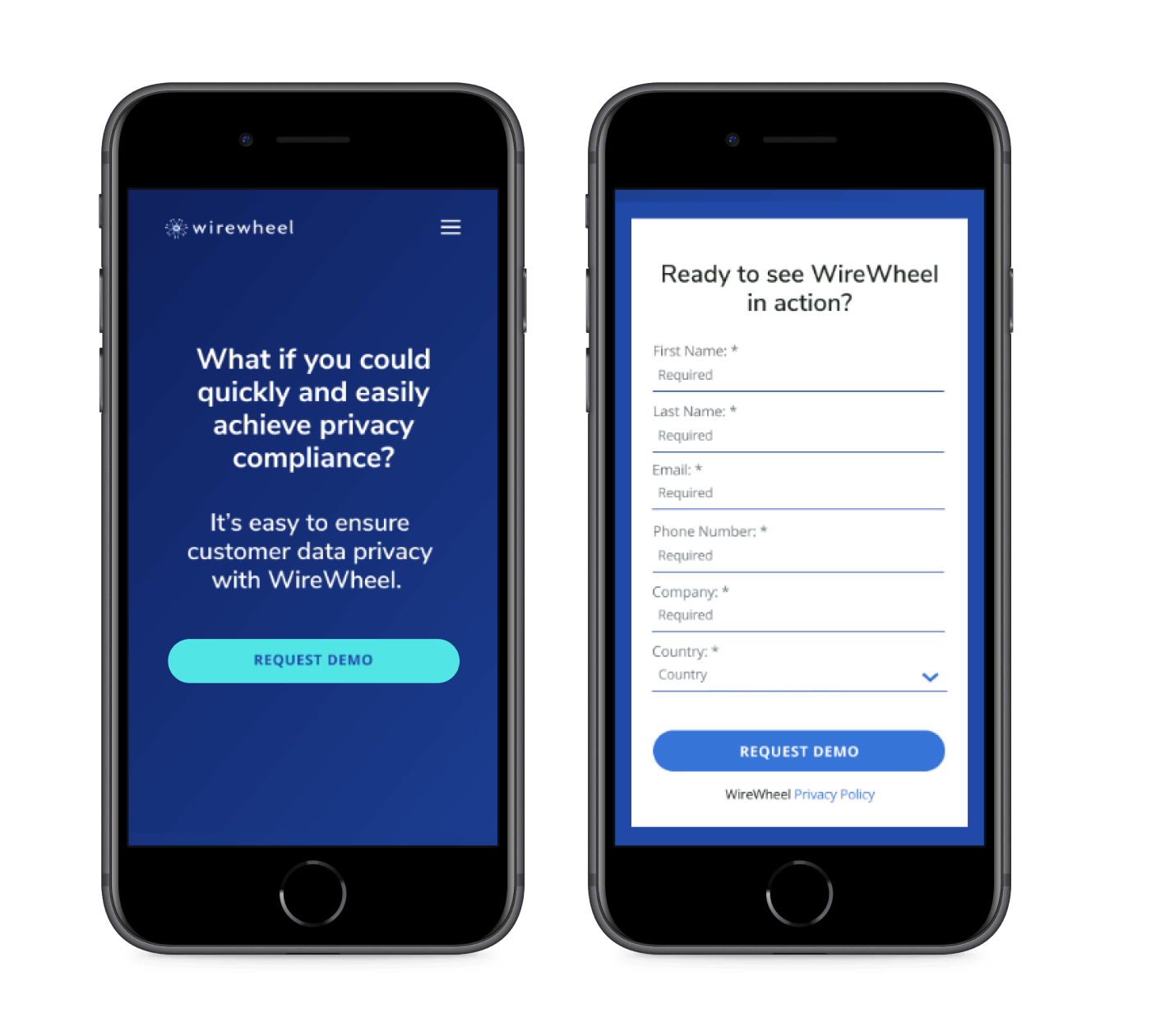
Added asterisks to indicate the required form field.
Added the placeholder text “Required” in form fields.
Implemented a full-width CTA button for the mobile to make clicking easier.
Placed the form above the fold for better visibility on the desktop.
Added a CTA button above the fold for the mobile to let users jump to the form without scrolling down.
Next Steps
Conducting the usability test will help to
measure how these updates affect the conversion rate.
to determine any additional areas to improve the user experience of the form and the demo page.


